
Understanding Grid
CSS: Cascading Style Sheets #
Grid is a way to layout web pages with rows and columns without having to use float or position.
Grid displays, like Flexbox, are applied to the parent container and only the immediate children are Grid items.
Example #
Let's copy the following code into an html file.
<!DOCTYPE html>
<html lang="en">
<head>
<meta charset="UTF-8">
<meta http-equiv="X-UA-Compatible" content="IE=edge">
<meta name="viewport" content="width=device-width, initial-scale=1.0">
<title>Grid</title>
</head>
<body>
<header>
<nav>
<a href="index.html">Home</a>
<a href="#">Sun</a>
<a href="#">Sand</a>
<a href="#">Fun</a>
</nav>
</header>
<main class="beach-grid">
<video class="path_video" autoplay muted >
<source src="https://byui-wdd.github.io/wdd130/images/path_beach.mp4" type="video/mp4">
</video>
<h1 class="path_title">Path to the Beach</h1>
<aside class="visit_us">
<img src="https://byui-wdd.github.io/wdd130/images/palm_beach.jpg" alt="Beach house">
<h2>Visit Us</h2>
<p>Beautiful island, palm trees, beach, sand, exotic, sea, and water.</p>
</aside>
<img class="icon1" src="https://byui-wdd.github.io/wdd130/images/beachchair.png" alt="icon beach chair">
<img class="icon2" src="https://byui-wdd.github.io/wdd130/images/flipflops.png" alt="icon flip flops">
</main>
<footer>
<p>Enjoy our beautiful beaches ©</p>
</footer>
</html>Let's use an external CSS file that will link up to the HTML page. We use the link tag inside the HTML to tell which CSS file will be used with that HTML page.
Inside the head element, let's add the link tag to the HTML page.
<head>
  <title>Grid</title>
  <link rel="stylesheet" href="styles/beach_styles.css" />
</head>
Let's create the folder called styles with a CSS file called beach_styles.css inside that folder. The styles folder will be at the same level as our HTML file. Open the beach_styles.css and let's add the following:
@import url('https://fonts.googleapis.com/css2?family=Delius+Swash+Caps&display=swap');
body {
    font-family: 'Delius Swash Caps';
    margin: 40px;
}
nav {
    padding: 40px;
    width: 60%;
    margin: 0 auto;
}
nav a {
    padding: 55px;
    text-decoration: none;
    color: black;
    font-size: 3em;
}
nav a:hover {
    background-color: #97bebe;
}
.beach-grid {
    width: 60%;
    margin: 0 auto;
}
.path_video {
    width: 100%;
    height: auto;
}
.path_title {
    text-align: center;
    color: white;
    font-size: 4em;
    text-shadow: -2px 0 black, 0 2px black, 2px 0 black, 0 -2px black;
    letter-spacing: .2em;
}
.visit_us {
    background-color: #cbc2c0;
    padding: 45px 45px 0 45px;
}
.visit_us img {
    border: 15px solid #97bebe;
    width: 350px;
    display: block;
    margin: 0 auto;
}
.visit_us h2 {
    text-align: center;
    font-size: 3em;
    padding: 25px 0 45px 0;
}
.icon1, .icon2 {
    background-color: #97bebe;
    padding: 80px;
    width: 395px;
}
.visit_us p {
    line-height: 2em;
    font-size: 34px;
    text-align: center;
}
footer {
    width: 60%;
    padding: 40px;
    margin: 0 auto;
}
footer p {
    font-size: 34px;
}
/* Grid */
This CSS quickly gave our page some styles but we want to layout the main with class 'beach-grid' in a grid.
Let's add our grid CSS under the /* Grid */ comment at the bottom of our CSS.
It's very helpful to be looking at our wireframe as we set up a grid. Here is what ours looked like:
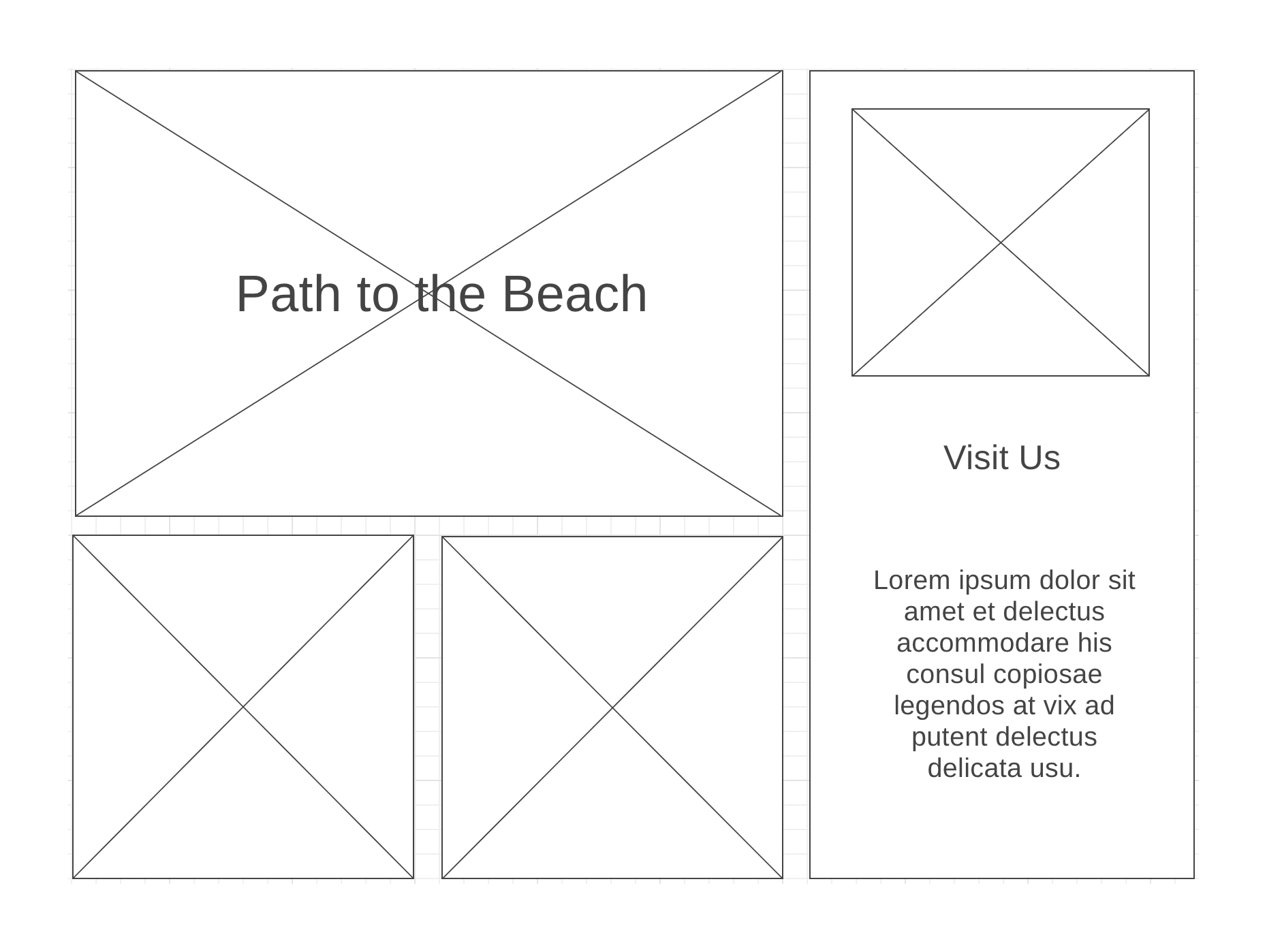
If we visualize how the rows and columns look we can see a good set up would be 3 columns and 2 rows.
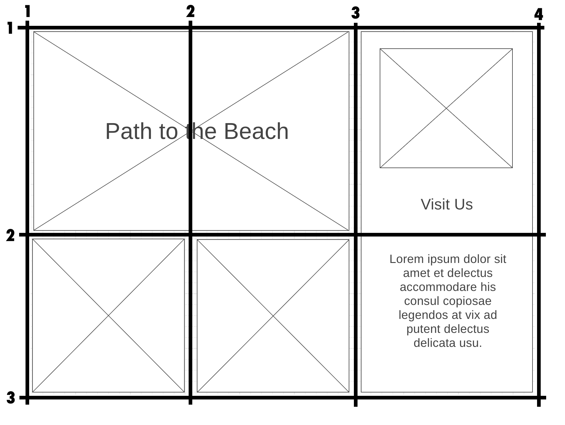
With this grid in mind, let's set up our grid in CSS. The parent of the grid is main and it has 5 children elements: video, h1, aside, img, and another img. Only the children can be placed in the grid not the grandchildren like the h2 or p. Those elements will go with the aside in the grid.
<main class="beach-grid">
    <video class="path_video" autoplay muted >
        <source src="https://byui-wdd.github.io/wdd130/images/path_beach.mp4" type="video/mp4">
    </video>
    <h1 class="path_title">Path to the Beach</h1>
    <aside class="visit_us">
        <img src="https://byui-wdd.github.io/wdd130/images/palm_beach.jpg" alt="Beach house">
        <h2>Visit Us</h2>
        <p>Beautiful island, palm trees, beach, sand, exotic, sea, and water.</p>
    </aside>
    <img class="icon1" src="https://byui-wdd.github.io/wdd130/images/beachchair.png" alt="icon beach chair">
    <img class="icon2" src="https://byui-wdd.github.io/wdd130/images/flipflops.png" alt="icon flip flops">
</main>
Targeting the parent element in CSS we use the display property with a value of grid. We also set up the columns in the parent element with the grid-template-columns property. Since we know we need 3 equal width columns, we will give 3 equal fractional units of measurement that allows each column to be one equal fraction of the whole space available to the grid.
.beach-grid {
    display: grid;
    grid-template-columns: 1fr 1fr 1fr;
}
Now you can see in your browsers that each of the 5 children elements were placed in order as they are in HTML into the grid with 3 on the first row and 2 on the next row. I would highly suggest you use your developer tools in your browser to take a look at the grid, it helps so much as you are trying to place your grid items. If you'd like to do this, right-click over your grid and choose 'Inspect'. In the HTML code that shows up in your developer tool, rest your mouse pointer over the main class='beach-grid' element and you should see the grid. This works best in Chrome or Firefox. Now you can see the grid and how the elements are being placed in it.
Our children elements are not where we want them to be however, so let's place them in the right place within the grid.
Our video will span 2 columns and one row in the upper left. We will use the grid-column shortcut value of 1/3 to indicate starting at grid line 1 and going to grid line 3 just like we saw above with the grid over the top of our wireframe. We could put grid-row: 1/2 as well with our video element but it has implicitly placed it there already.
video {
    grid-column: 1/3;
}
Now if you take a look at your grid, the video takes now 2 columns instead of one and the rest of the children are bumped over by one. Let's keep placing the rest of the children in the grid according to our wireframe.
The h1 will actually overlay in the same spot in the grid so we can give the h1 the same grid-column values of one to three.
h1 {
    grid-column: 1/3;
}
Take a look at what happened. The h1 is now taking 2 columns, but it is on the second row. It implicitly placed it in the next open columns of 1 to 3. So we will need to explicitly place it in row line one to row line two.
h1 {
    grid-column: 1/3;
    grid-row: 1/2;
}
Now since we left the video with no row explicitly specified it pushes it down. So lets put an explicit column-row on the video as well.
video {
    grid-column: 1/3;
    grid-row: 1/2;
}
Now the h1 and the video are in the same spot on the grid. Because the h1 comes after the video in the HTML, it is behind the video. To bring it on top we could change the order in HTML or give the h1 a higher z-index than the default 0 to bring it forward. Let's do that.
h1 {
    grid-column: 1/3;
    grid-row: 1/2;
    z-index: 1;
}
We can also center the h1 vertically in its spot in the grid with a align-self: center. We will learn more about aligning and justifying items later.
h1 {
    grid-column: 1/3;
    grid-row: 1/2;
    z-index: 1;
    align-self: center;
}
If you look at the grid now in your developer tools, you see that the next child, the aside looks like it's in the right place however, notice it is only taking one row and we need it to take two rows. So let's give it a grid-row of grid row line 1 to grid row line 3. Again, we would explicitly place the aside into grid-column lines 3 to 4, but it has implicitly already gone there and notice the last two img children also are going into the right places as well.
aside {
    grid-row: 1/3;
}
Let's also put a little bit of space between all the grid items with a grid-gap value of 40px placed in the grid parent element CSS.
.beach-grid {
    display: grid;
    grid-template-columns: 1fr 1fr 1fr;
    grid-gap: 40px;
}
Now all the grid items should be in the right places according to our wireframe.