WEB Fundamentals
WDD 130
Building a simple media card
Activity Instructions
Estimated Time: 60 minutes
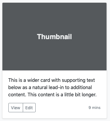
This activity is an opportunity to pull together many of the things you have learned this semester by writing the HTML and CSS to build a simple media card UI. Below is a mockup of what our component should look like when done. (A component is just a part of a web page that is commonly used more than once.)

-
Set the foundation
Review the mockup above. It looks like there are three groupings of content. The image above, the paragraph, and the buttons and time on the bottom. We need to add the HTML elements to define those areas.
Create a new file in your editor and name it card.html. Remove anything that might be in the
bodyelement and add an<article>element and give it a class of card. This will be the basis of our media component.Next add an image. You can use https://picsum.photos/320/240 for the src. It will pull a random image of the correct size for our component.
Next add a paragraph. You can pull the contents of it from the mockup above.
Finally add a
<footer>. It should have two buttons in it (give one a class of viewButton and the other a class of editButton), and a span which will hold the time. -
Base style.
For our CSS to keep it simple we will use a
<style>element in the<head>. All of your CSS should go in that element. Begin by adding the following rule to the top of your css as well. It will make the image work correctly.img { max-width: 100%; }Next add a
.cardclass. Make the width of our card 320pxYou should also notice that the card has a white background, a slight shadow, and rounded corners. Rounded corners can be accomplished with the border-radius property. It can take 1 or 4 values. If one then it will apply the same curve to all four corners. This is what we want here.
The shadow under the card can be done with the css3_pr_box-shadow property. Check out the preceeding link for details...but for now I will give you some settings that will work for us.
.card {
  width: 320px;
  box-shadow: 1px 1px 4px 1px #888;
  border-radius: 3px;
  background-color: white;
}
That will get you started.
-
Finishing up
For the rest of the styling the following details will be helpful:
- Set your font to a nice sans-serif font. Arial or Helvetica should work.
- If you give border-radius 4 values, it starts with the top left corner and goes clockwise. So 3px 0 0 3px would curve the top-left and bottom-left corner for example.
- For the grey colors #888 is a nice medium grey, and #ccc is a nice light grey
-
Remember that the space between two elements is controlled by
margin. The space between the contents of an element and the border of the element is controlled bypadding. You will need to add padding to many of the elements to get your component to look like the mockup. -
As you work on rounding the corners of the card, if you have
issues with the top corners it is probably the corners of the
image covering up the rounded corners of the box. You can use
the
overflow
property to fix this. Adding
overflow: hiddento the card will make any content that falls outside of that element be hidden (like the square corners of your image).
-
Upload to ILearn
Upload your link to ILearn.