WEB Fundamentals
WDD 130
CSS Positioning II Activity
In this activity we will take another look at positioning and layout with CSS. We will get some more practice using CSS Grid and also look closely at alignment. Both with Grid and without.
Activity Instructions
-
Grid Practice
Visit CSS Grid Garden and complete all 28 levels. It will probably be helpful to have the Complete Guide to CSS Grid open in another window for reference. Take a screenshot of the final screen when you are done. This will be one of the two images you will submit to Ilearn.
-
Grid Alignment
You may want to review the following short videos before completing the next section.
- Align grid items (4min)
- Align the Grid (4min)
Vocabulary time! There are a few terms we should learn to help make sense of alignment with CSS Grid.
justify-content- Aligns the grid container along the inline axis (by default horizontal). This only works when the grid is narrower than the space available.
justify-items- Aligns the grid item contents along the inline axis (by default horizontal). This only works when the contents of a grid cell are narrower than the grid cell.
align-content- Aligns the grid container along the block axis (by default vertical). This only works when the grid is shorter than the space available.
align-items- Aligns the grid item contents along the block axis (by default vertical). This only works when the contents of a grid cell are shorter than the grid cell.
So to review, justify aligns horizontal by default, align takes care of the other direction (vertical alignment by default). If we want to align the grid container we use the content suffix. If we want to align the contents of the grid items within the grid cells then we use items
Visit this codepen (Codepen is a site that allows you to practice writing HTML and CSS). You should see three sets of four boxes. The boxes have already been positioned into a square using CSS Grid. There are some differences between them however. If you look at the
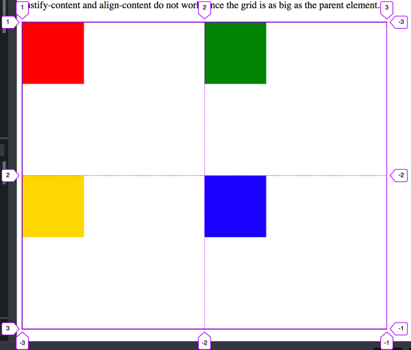
.content1class you will see that the rows and columns have been sized using 1fr. So the grid will use up all the space available in the grid container, and we will end up with 2 equal columns and 2 equal rows.If we look in the browser development tools at the actual grid we see this:

Grid lines for content1 Let's try centering the grid and grid items. Add the following to
.content1justify-content: center; align-content: center;You might be surprised to see nothing happened until you remember that content refers to aligning the grid container. The grid container is completely filling the parent element it is in. If something is as big as its parent then it is technically already centered...it can't move.
Next add these lines one at a time:
justify-items: center; align-items: center;Now we see something happen! The boxes centered themselves inside of the grid cell they were in. First horizontally (justify), then vertically (align)
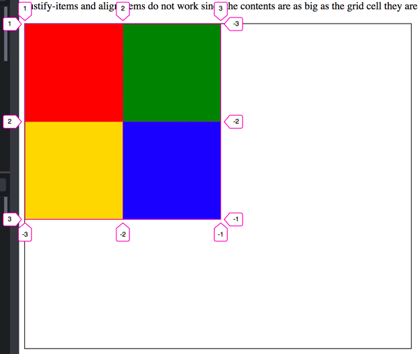
The next example uses rows and columns of a fixed size. 150px to be exact. This time the contents of the grid is the same size as the grid cell, but the grid itself is smaller than the space it has available. Here is a picture of the grid lines this time.

Grid lines for Content2 This time if we attempt to align the items nothing happens. Try adding the following properties to
.content2justify-items: center; align-items: center;...but now we can align the grid container. Add these one at a time:
justify-content: center; align-content: center;Last example. For
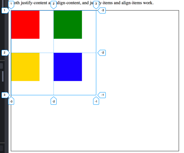
.content3. We have the grid container smaller than the parent, and the grid items smaller than the grid cell.
Grid lines for Content3 Add the following four lines to the
.content3rule one at a time and watch what happens.justify-content: center; align-content: center; justify-items: center; align-items: center;Perfectly centered content!
-
Other ways to align.
Earlier in the semester you were introduced to the concept of block and inline elements. Blocks flow vertically down the page by default, and inline flows horizontally across. You were also shown how to align both inline and block elements. Let's review that again now.
For this part of the activity your mind might jump to Grid as a way to solve this. You could actually do it with Grid, but in this case we want to try something different. You will not need a Grid for this part.
Since we are not using Grid, the alignment properties we studied above (justify-items, justify-content, align-items, and align-content) will not work. They only work inside of a Grid!
Block elements first: block elements take up 100% of the width available to them. So if we want to align them we first have to set a width of less than 100% on them. Then we can set the left and/or right margin to auto. For center we would set both left and right to auto (
margin: 0 auto;), for right aligned blocks we would set just the left margin to auto (margin-left: auto;). Blocks are left aligned by default so we don't have to do anything for that!.You can use this codepen to practice.
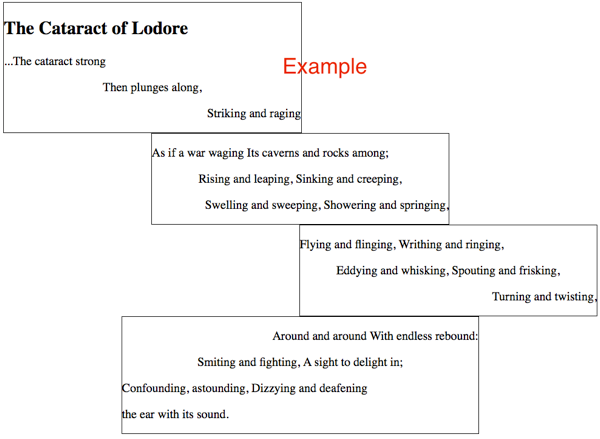
Take a look at the following screenshot to see what we are trying to do.

Poem alignment example The alignment of the poem can be described like this:
- Block 1 should be left aligned
- Block 2 should be center aligned
- Block 3 should be right aligned
- Block 4 should be center aligned
- The first paragraph in blocks 1,2,3 should be left aligned.
- The second paragraph in blocks 1,2,3 should be center aligned.
- The third paragraph in blocks 1,2,3 should be right aligned.
- The first paragraph in block 4 should be right aligned.
- The second paragraph in block 4 should be center aligned.
- The third and fourth paragraphs in block 4 should be left aligned.
All of our blocks are made of
<section>elements. Remember that if we want to align a block element (sections are block elements) we need to set a width, then adjust the margins. Set a width of 50% on all of the<section>elements.Then set the alignment of each block by adjusting the margins appropriately.
Next we need to align the paragraphs. We can use the
text-alignproperty to align the text inside the paragraphs. We set thetext-alignproperty on a block like aporh1for example and it will affect everything inside of that block.We could add a class to each paragraph and change them that way...but that is a lot of extra typing, and there is another way. We can take advantage of complex selectors. Specifically the :nth-of-type() pseudo selector.
:nth-of-type()counts the number of times a particular element is the child of another element. Here is an example with paragraphs:p:nth-of-type(1) { /* first paragraph */} p:nth-of-type(2) { /* second paragraph */} p:nth-of-type(3) { /* third paragraph */}Using those selectors write the css that will format the text according to the requirements above. Note that block4 is formatted differently than the others. For those paragraphs we will need to be more specific. Target just paragraphs that are in the
.block4element.We can use the descendant selector to do this. (<-- If you don't remember what that is check out the link. We used some of these when we styled the menu for the Dry Oar Site so you could also review the Final Touches activity from Week 7 as well). Still needing help? Try this video:
-
Take a screenshot and submit
Once you get your alignments all right...take a screenshot of the text and submit it to ILearn. This will be the second of two images you submit. Note that you may need to adjust the width of your browser window once you are done to get yours to look just like mine.