WEB Fundamentals
WDD 130
Creating a Site Plan
Activity Instructions
Estimated Time: 60 minutes
What is a Site Plan?
Developing a site plan is a critical step in any web design process. Site plans help establish the purpose of the site, the voice, and overall look and feel...and then they help you apply those consistently across your site.
Site plans come in many shapes and sizes, and level of detail. Here is a list of common elements in a site plan
- Statement of purpose and goals
- Definition of audience
- personas and scenarios - Who will use the site and how will they use it?
-
A Style guide:
- Branding information - how to use the branding for the site correctly
- Typography choices and justification
- Color palette
- Specific styling of elements on the site...ie headings, lists, paragraphs, forms, links, buttons, etc
- A site map
- Wireframes showing general layout and content for major pages
We will be making a simplified site plan for our web site. Ours will focus on the sections for Purpose, audience and a partial style guide. Since the style guide will be the largest portion lets take a look at a few examples to get a better idea about how they are put together.
Examples
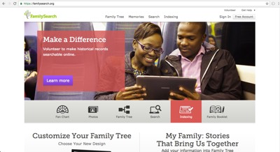
FamilySearch
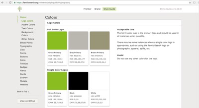
FamilySearch has a nice styleguide viewable by anyone. Notice how many colors they use! As you browse around the actual site do you think it's too many or does it work? Notice that they also have a section about font sizes and paragraph and headline styling, but it never really mentions which fonts they use.
Take a moment and think about the purpose and audience of the site. Does the site accomplish the purpose well and cater to its audience? What do you like/dislike about this site? Share your thoughts with the class.
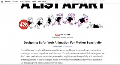
A List Apart
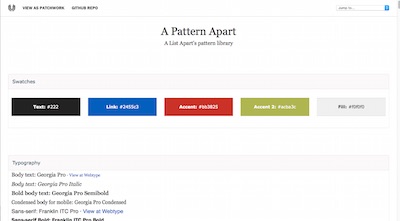
A List Apart is a website by web designers for web designers. Much of it's content comes from guest authors so having a well defined style guide is essential to keep everything consistent. The different fonts and colors are clearly defined, then it defines the styling for the many different elements you might find in an article...it even includes example html!
Take a moment and think about the purpose and audience of the site. Does the site accomplish the purpose well and cater to it's audience? What do you like/dislike about this site? Share your thoughts with the class.
Activity Directions
All of those examples were much bigger and more complex than what we will do for our site. However even though our site will be a simple 2 page website for a White Water Rafting Company, this planning phase is still important and you are expected to produce a site plan that is complete and professional looking.
-
Template
Begin by logging into your editor (Glitch). Look for two files: site-plan.html and site-plan.css. Open the site-plan.html file. You will notice lots of HTML comments in the file. See an example below:
<!-- In the header above, add your name and class number. For example if you are in section 3 you would put WDD 100.03 -->Read all of the comments! They include important instructions. You will also see portions of text wrapped in square brackets like this:
<h2>WDD 130-[section]</h2>In this case you will be expected to replace the [section] with your information. There shouldn't be any square brackets left in the file when you are done!
Take a minute right now to review both of the site-plan files. The HTML one should look somewhat familiar from last week. Try to follow what is going on in that file and guess what each line will do. The CSS one will be new. Look over it as an example of CSS and try to identify examples of the CSS terms introduced in the CSS Vocabulary activity, but you are not expected to understand everything that is going on there at this point. (Go and complete the vocabulary activity right now if you have not done it!)
-
Purpose Statement
From the beginning, websites have always been about displaying content. This is the underlying purpose behind every site on the internet, or at least it should be. In order to determine which content you should put on the site it is critical to determine the purpose or goals of the site. The content should support that purpose. At a high level these purposes can take many forms:
- Build Revenue Build revenues for your new/existing business or
- Share Information Share corporate or educational information or
- Share Opinions Share opinions on a subject or
- Share Personal Interests Share personal interests with family and friends
All websites should have a purpose, and that purpose should be more than 'My teacher is making me do this.' :) Earlier (see above) you should have spent some time analyzing a few websites to try and determine what their purpose is, and who their audience is.
We need to do this now for our website. One problem: the purpose really needs to be defined by the site owner and not the site builder. So for this step and the next imagine that you are the owner of the business and have decided that it is time for you to have an online presence. Develop a purpose statement that clearly defines your goals for the website. Find the portion of the site-plan.html file for the purpose. (It should be around line 22-23). It looks like this:
<h3>Purpose</h3>
<p>[Your purpose here]</p>  <!-- change this -->
Replace [Your purpose here] with your purpose statement. (at least 100 words)
-
Audience Statement
Another important factor to keep in mind when planning a website, is the audience for the site. Remember, that websites are all about content. The purpose helps define what content you should include, and the content should target your specific audience or audiences (websites can have more than one).
Write a statement specifically identifying your target audience. Try to answer these questions:
- Who are the target customers? Describe their life (or business) situation (age, financial situation, interests, etc)
- What do they want?
- What are their needs that aren't being met?
- How will my audience usually access my site (desktop, laptop, mobile device)? (at least 100 words)
Add your Audience to your siteplan just like you did for the Purpose above.
-
Choose a logo
Choosing a logo. One Dry Oar logo is in the document. You can keep that one, create a logo of your own, or choose from the image choices in the link below:
-
Color Theory
Color plays an essential role in any website and so the colors you use should be chosen deliberately. There are volumes of material on color theory that can help with these choices.
To learn more about color theory try these sites
- http://www.colormatters.com/color-and-design/basic-color-theory
- http://www.worqx.com/color/color_basics.htm
- http://www.smashingmagazine.com/2010/01/28/color-theory-for-designers-part-1-the-meaning-of-color/ - This one specifically addresses color in design
Visit coolors.co and keeping your site purpose and audience in mind build a color scheme using it. Start by thinking of a color you like or think will work well for your site.
-
Using Coolors.co
You will see 5 color stripes. Each color has 4 items on that show when you hover over them: Alternative Shades, drag, adjust, and lock. Play around with one color until you end up with something like you imagined above... then lock it. Hit the space bar on your keyboard to generate different complementary color schemes for the color you chose. Feel free to lock other colors and generate until you end up with 3-4 colors you like.
-
Record the color codes

Once you have built your palette note that at the bottom of each color column there is a 6 digit "number". This is what is known as a hexadecimal color code and is usually preceded by a "#". These codes are the most common way to represent colors on the web. Copy that code for the 3-4 colors you would like to use into the Site plan document (around line 50-60). Place the color you want to use the most often as the primary.
After entering the codes into the HTML file switch to the site-plan.css file. Look at lines 8-11. Notice that there is a place to record your colors there as well. Do so, then look at the Preview. You should see your colors showing in different areas!
-
Save your color scheme
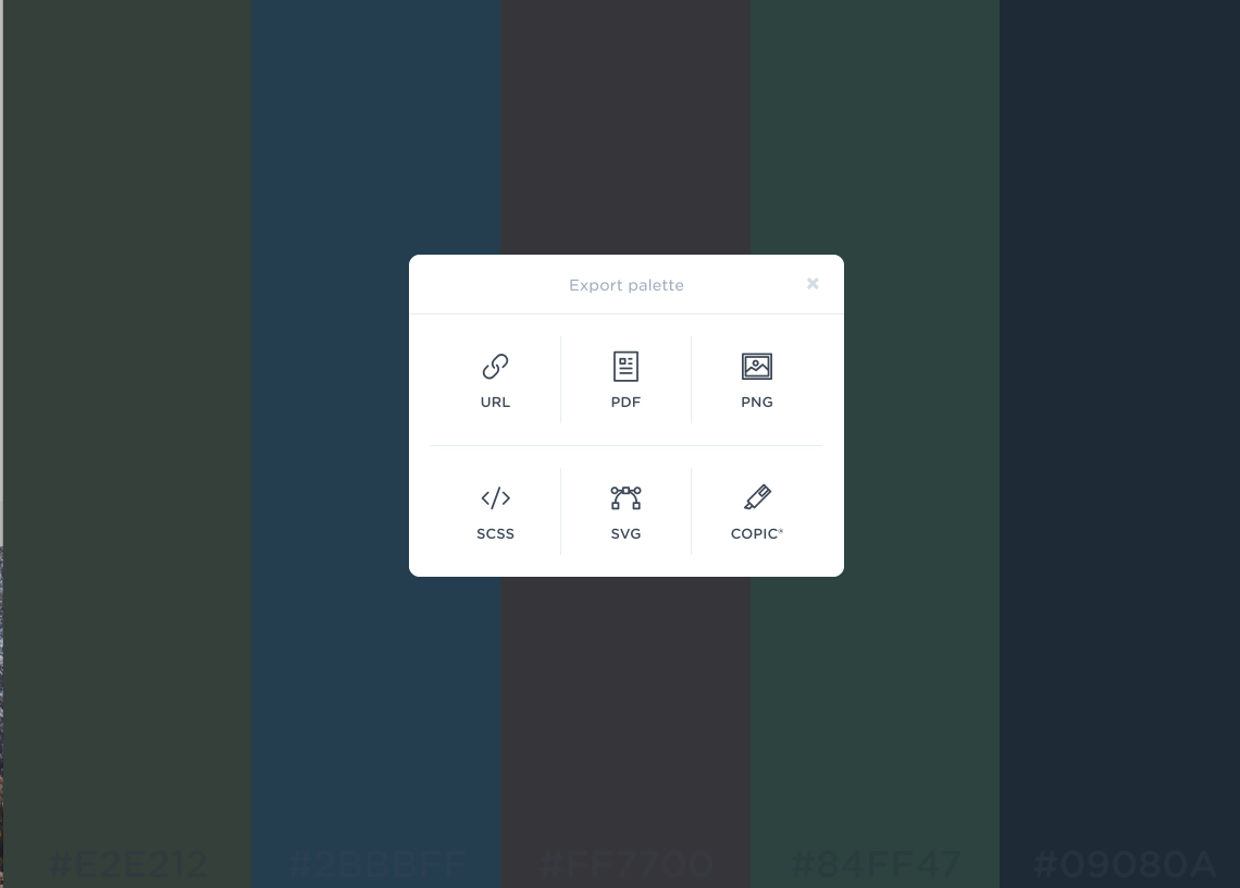
You should save your chosen palette URL from coolers.co in case you need to make any changes later. Copy the URL of your scheme. (mine looked like this: https://coolors.co/b7d3f2-afafdc-8a84e2-84afe6-79beee) and paste it into your site-plan.html in two places Look around line 40-60 for the line that looks like this:
Palette URL: <a href="https://coolors.co/396e94-e7c24f-a43312-381d2a-aabd8c" target="_blank">https://coolors.co/396e94-e7c24f-a43312-381d2a-aabd8c</a>Notice that when working with links in HTML the destination of the link goes in the src attribute. Then the part you click on goes inside of the
<a>element. Often those will be different...but in this case we are going to make them both the URL to your color scheme. -
About Fonts
It's time now to choose a font or fonts that you will use for your site. Along with the colors you choose, fonts have the next largest (or maybe even larger in some cases) impact on the look and feel of your site. To help you think about this watch the following short video and review the tips below.
Here are a few tips:
- Make sure the main font you use (the one that most of the text is in) is very readable.
- It is OK, and often desirable to have more than 1 font on a page, but if you use more than 2 make sure you have a good reason for it.
- If you use 2 fonts make sure there is good contrast between them...ie make sure they are different enough that they will never be mistaken for the same font. A common pattern is to have a very readable font from one font-family (serif, san-serif, script, monospace, fantasy) for all the body copy (paragraphs), and a font from another family for the titles and headlines.
- While you should usually sacrifice creativeness for readability for paragraphs, you can usually get away with something more fun for headlines. They are usually larger in size and only a few words in length, so feel free to experiment a bit more here.
- For a page that loads very quickly you should stick with web-safe fonts. These are fonts that can be found on every computer. (Not all fonts are on every computer.) A list can be found on W3Schools
- Google has a large list of Fonts that can be used on websites as well. Using them will add a small amount of time to the speed at which the page loads...but often it is worth it to get the right font.
- Here are a couple of links to articles with more great tips.
-
Choose your fonts
Choose one or two fonts to use for the site and record them along with your reasoning for choosing them in the Site Plan. Then we need to enter your fonts into the CSS file as well so we can really see what they will look like.
If any of your fonts are from Google then look at line 4 in site-plan.css. This line lets our page know where to find the fonts we need. Change the example font names there to your fonts. Notice that if your font name has any spaces in it you should replace them with '+'. Look at my example:
I want to use the following two fonts from Google: IM Fell French Canon SC and Lato
@import url('https://fonts.googleapis.com/css?family=IM+Fell+French+Canon+SC|Lato');Notice in the
@importmy first font got changed to: IM+Fell+French+Canon+SC (spaces replaced with +). My second font was a simple one word font to it was added just as it was with a | (shift + \) separating my fonts. -
Color your fonts
Often you want your text to appear on a colored background. Let's pick some colors from your pallette that will work well together.
See if there are two colors in your scheme that can be used as text color/background color where the text remains readable (you need a high contrast between the colors). Black and White are always fair game even if they aren't in your color scheme :) You can always visit contrast-ratio.com to make sure your text and the background of the text have a passing ratio.
Switch to the site-plan.css file and look at lines 18-22. Should look like this:
--headline-color-on-white: black;  /* headlines on a white background */
--headline-color-on-color: #FFFFFF; /* headlines on a colored background */
--paragraph-color-on-white: black; /* paragraph text on a white background */
--paragraph-color-on-color: #FFFFFF; /* paragraph text on a colored background */
--text-background-color: #000000;
Change the
--text-background-colorand then--headline-color-on-colorand--paragraph-color-on-colorvalues. If done correctly you should see an example of your colors together in the Preview of your page in Glitch. If any of the text is hard to read then try different colors. -
Style your navigation
Finally from your color palette choose the colors you would like to use for your navigational links (normal, hover, active, and visited) and enter those colors in lines 23-26 in the site-plan.css file. If you would like specific styling for other links on the pages you can provide those on the Links section under HTML elements.
Think of two child pages you would be interested in creating (these may change as time goes on) and put the names in each of the two empty boxes in the nav bar image. (In the directions, there are several page suggestions listed. You can choose two of those or come up with your own, but the names should be one or two words max.) We will eventually build only one of these pages.
The next section is the site map. It also has 3 boxes: home and two empty boxes. Put the same two child page names you chose for the nav bar boxes.... these MUST be the same names for both parts.
The last page has a wireframe. The wireframe shows what the page will look like, how it will be laid out. We will not be changing the wireframe yet, just review it. In the following weeks you will use the wireframe provided to help you to create the home page for the site. Even later in the semester you will create wireframes for the two pages you selected above, and build them as well.
-
Submit to Ilearn
Check your site in Glitch, and upload your URL into Ilearn
